
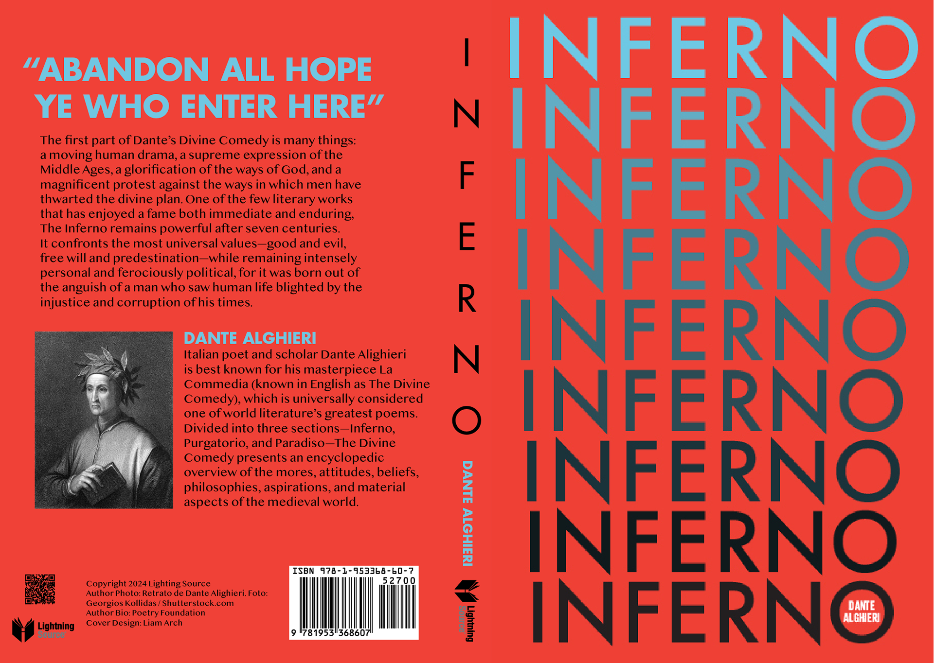
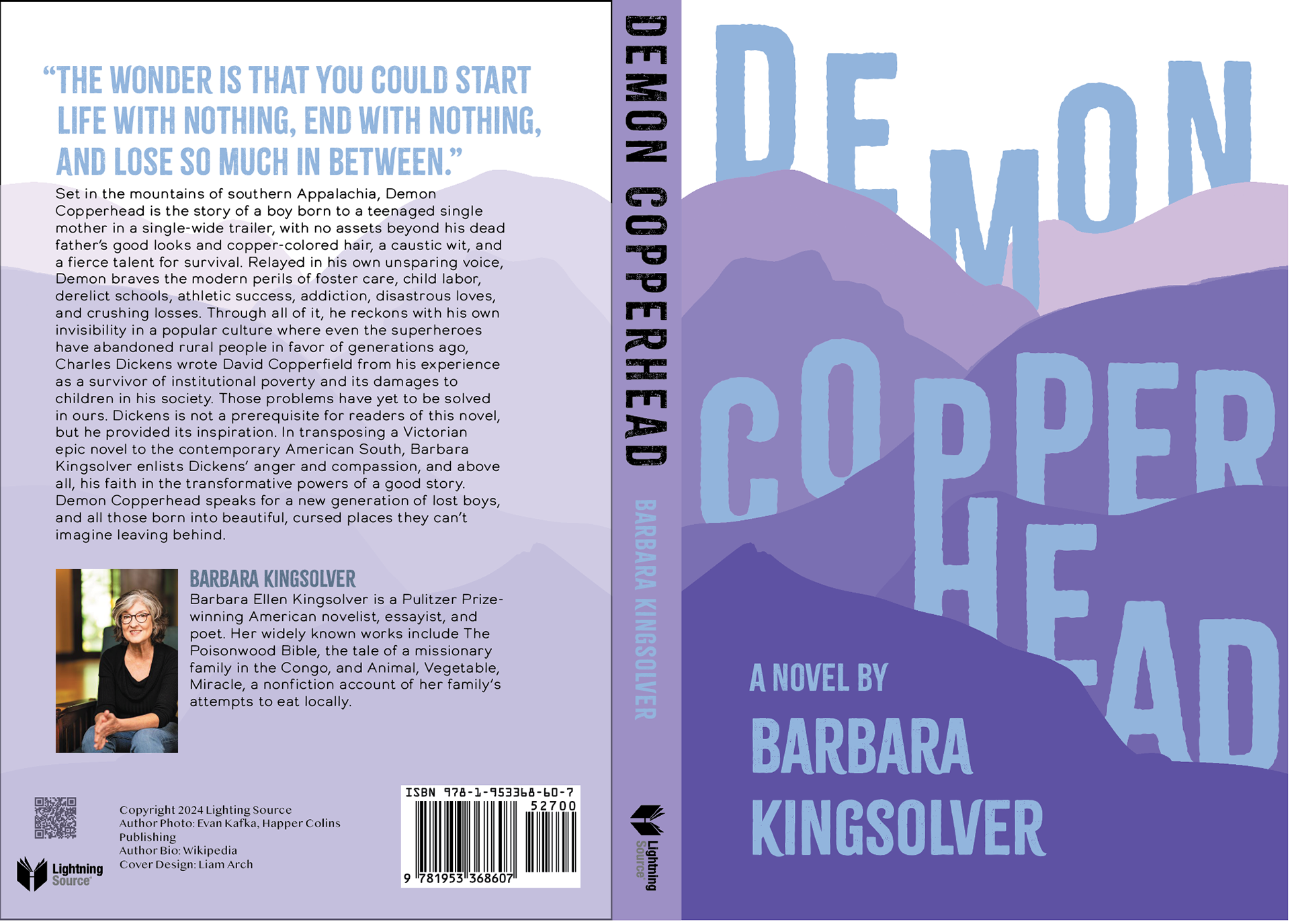
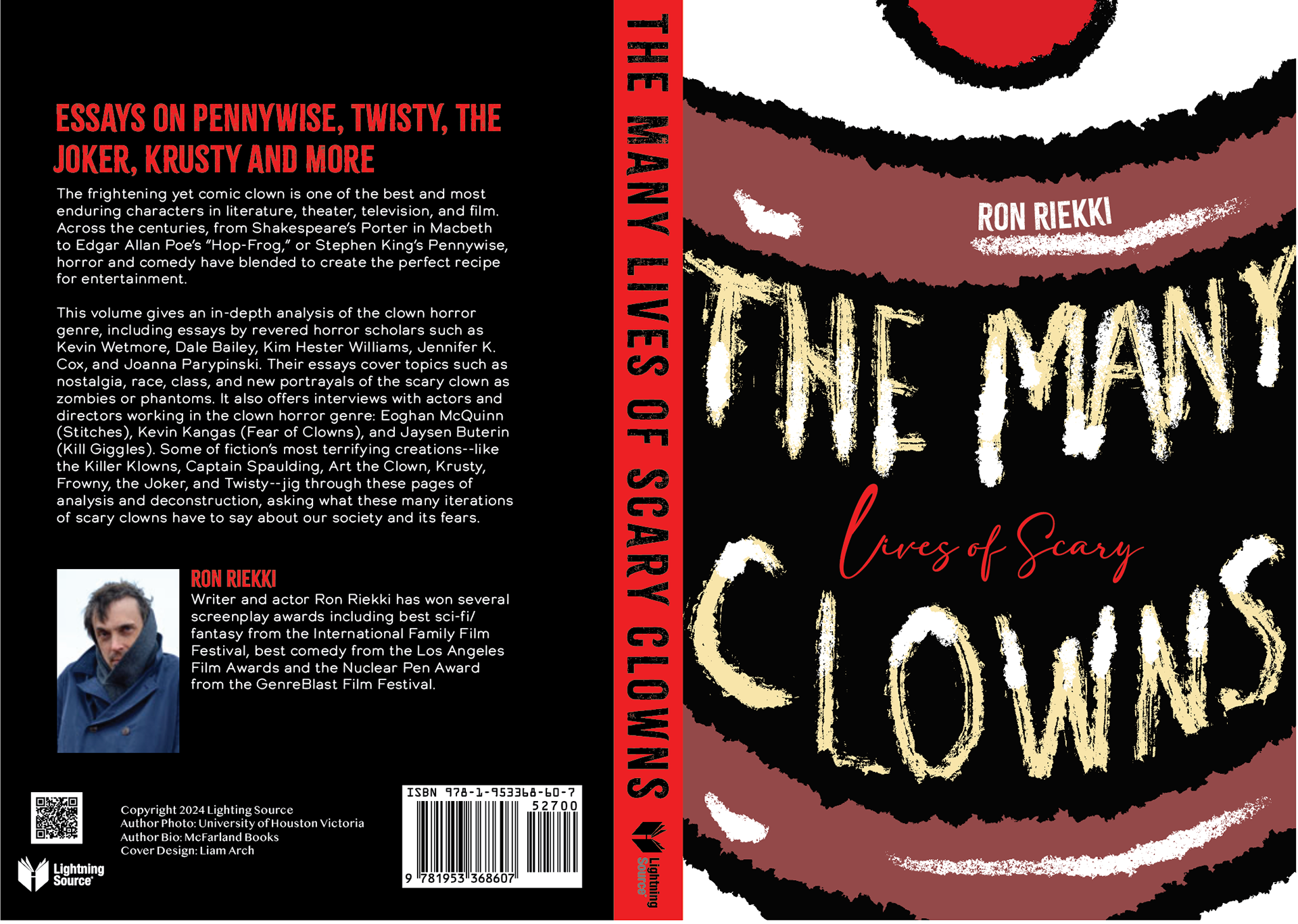
A series of book covers, one for a classic, another for a Pulitzer Prize winner, and another for a comical informative book. I'm quite proud of the Inferno cover, with the type reminiscent of each layer of Hell Dante traverses, or the depth of the type that flows over mountains with a ligature on Demon Copperhead, or the transformation of letters into teeth for The Many Lives of Scary Clowns.
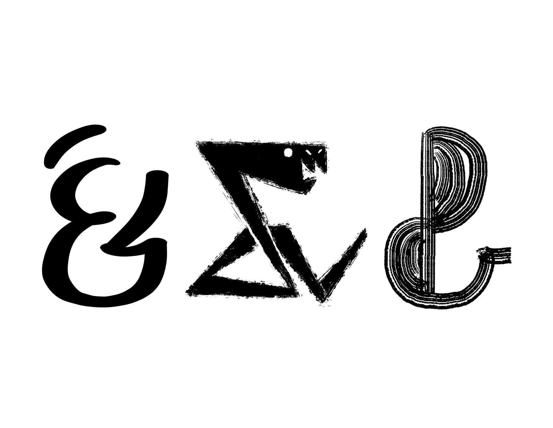
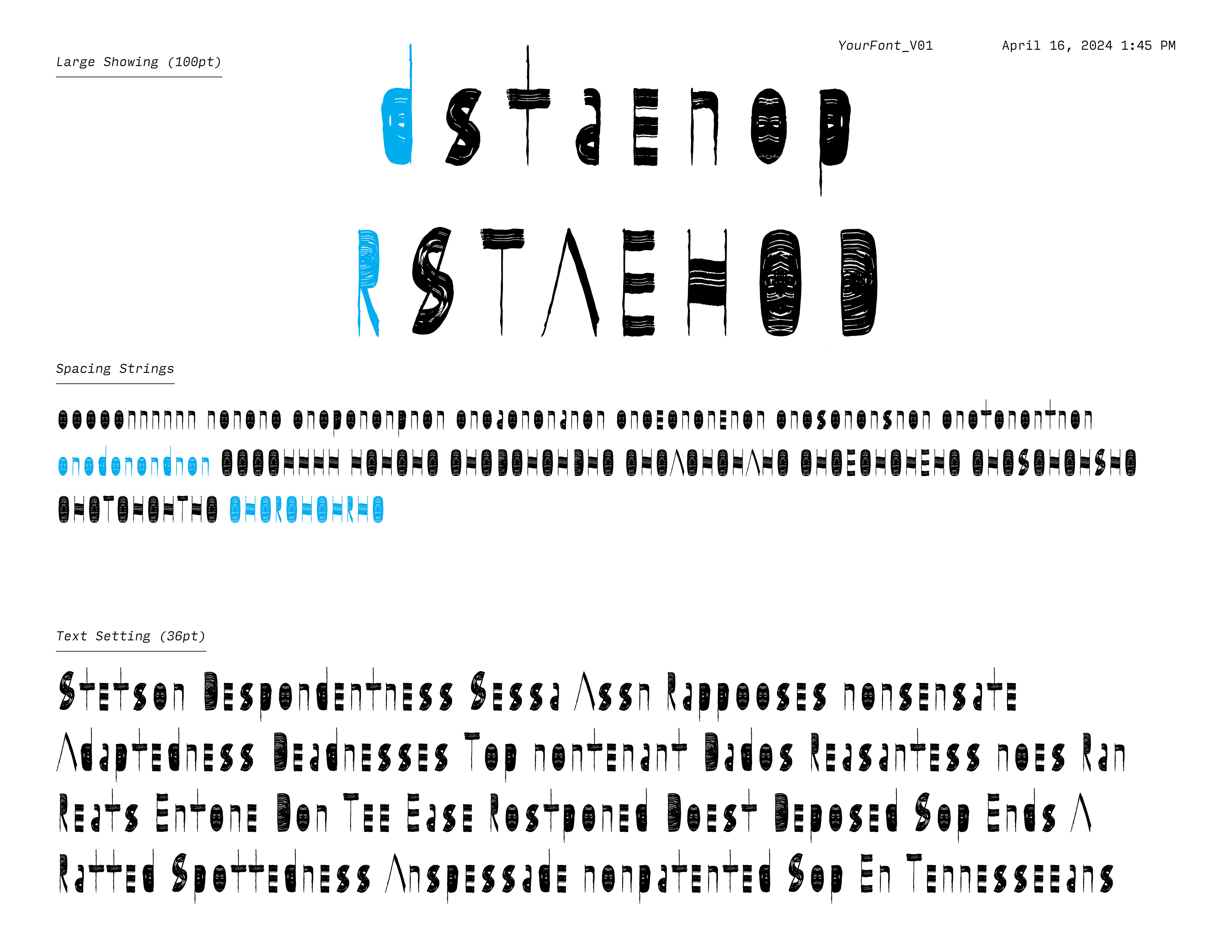
Both of the pieces are mark making explorations, the one on the right being three ampersands made using different digital pens in Procreate, while the typeface proof on the right was made by scanning hand-inked letter components into Adobe Illustrator, assembling them, then turning them into a working typeface in Glyphs Mini 2. I wanted to bring my illustration skills to typography through these exercises, and I want to one day flesh these out into fully formed typefaces.